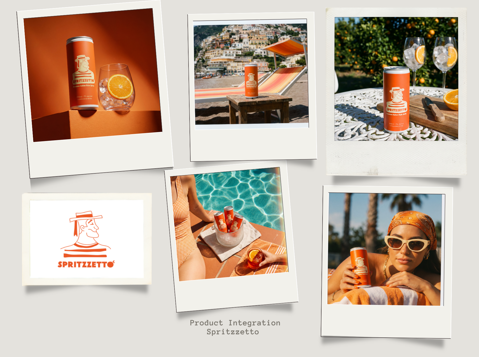
The Challenge: Authentic Italian imagery is expensive - flights, crew, and location shoots can run six figures. Yet without that sense of place, premium beverage brands struggle to stand out or evoke the emotional connection that drives purchase decisions. Spritzzetto needed Italian summer authenticity without the international production budget.
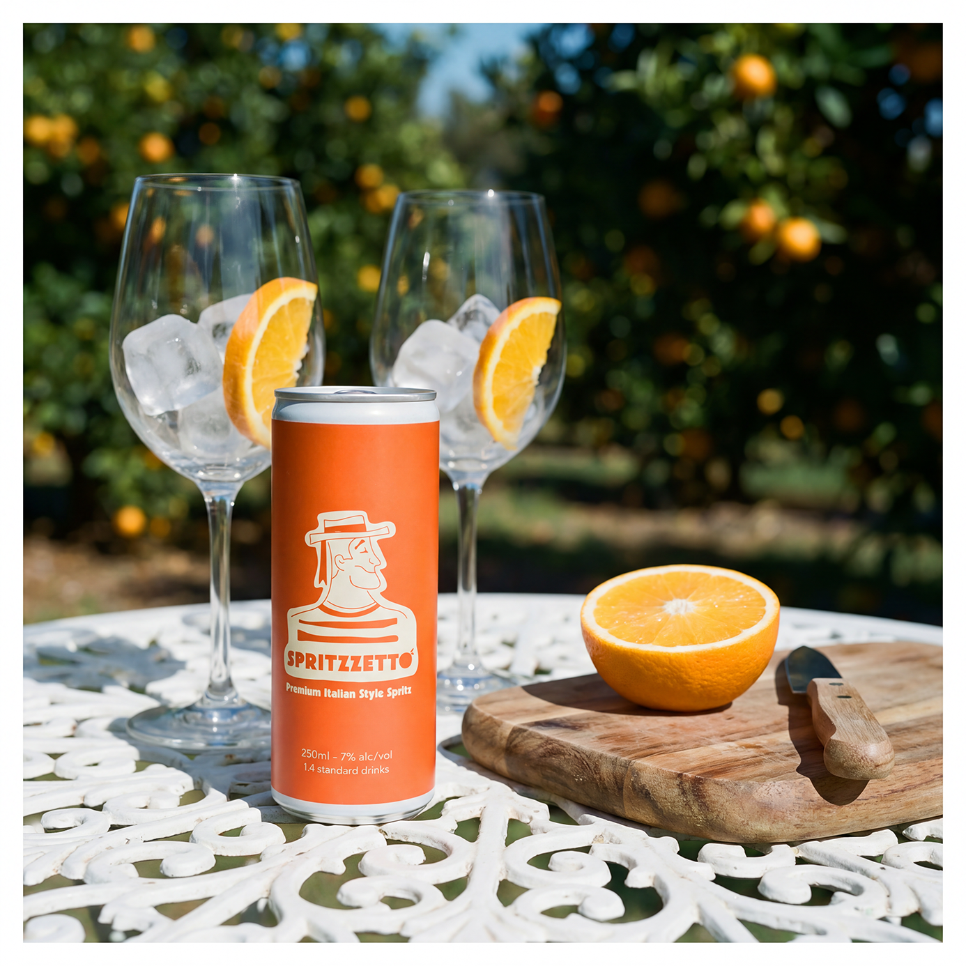
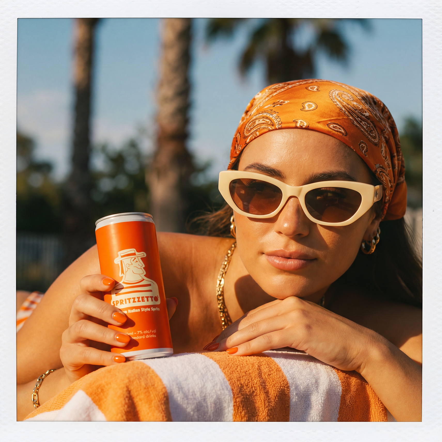
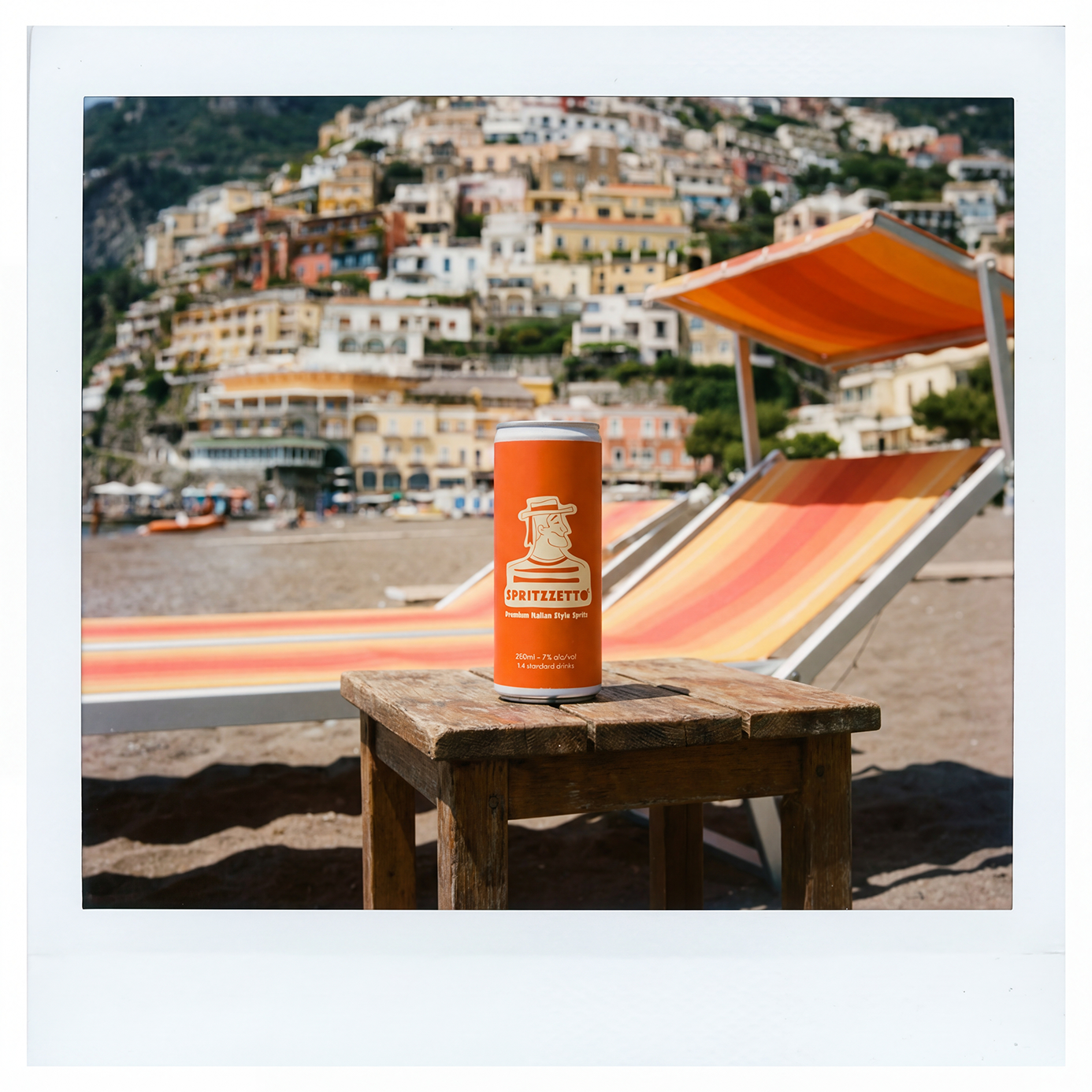
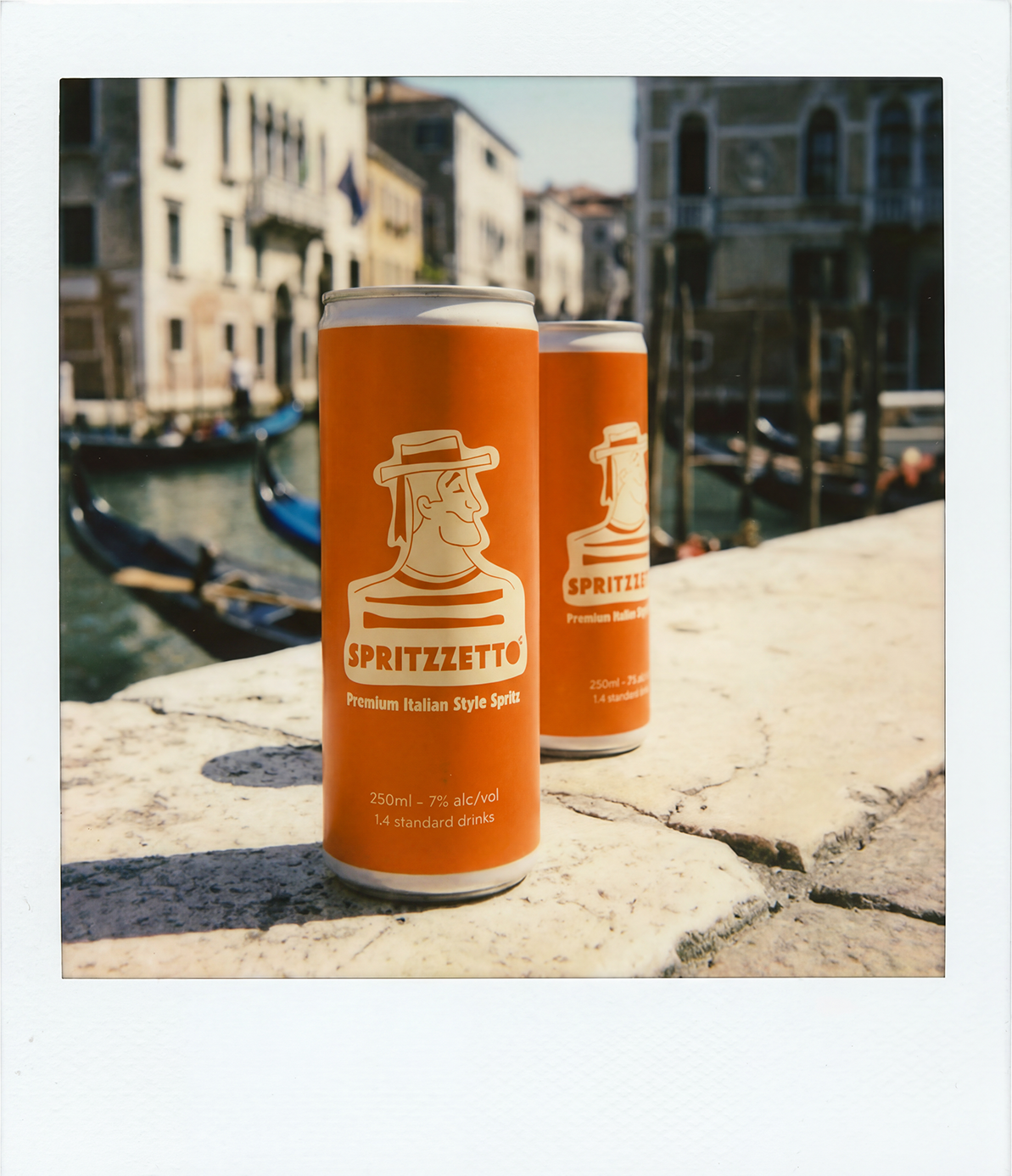
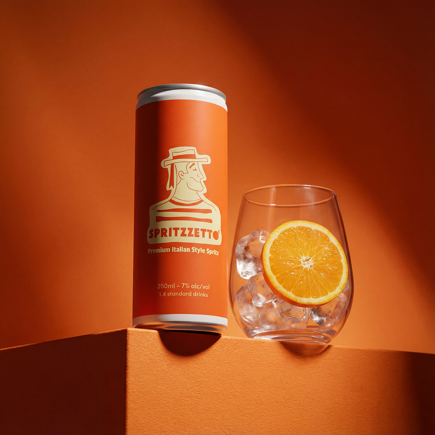
Our aim with the imagery was to develop a visual treatment rooted in Italian summer nostalgia - crafting each image around the warmth and ease of la dolce vita. We leant into a rich palette of burnt orange and terracotta, letting the can's color become a natural hero in every frame, offset by turquoise water and golden-hour cream tones.
Every image was created in a Polaroid-style format with soft white borders, reinforcing an analog, sun-faded authenticity. We wanted to highlight Spritzzetto's heritage, so created quintessentially Italian settings - Amalfi coastlines, Venice canals, poolside terraces, and citrus groves - styled with retro props, linen textures, and vintage swimwear to evoke a long, unhurried summer afternoon.
Technically, we applied shallow depth of field on product shots, introduced film grain throughout, and lifted the blacks to achieve that signature faded-film quality, with golden-hour lighting, soft shadows, and lens flares woven in to complete the mood.